|
Cap Banditry. Hunting
Off-Catalogue Sheaffer Balance Cap-Bands
(cover) 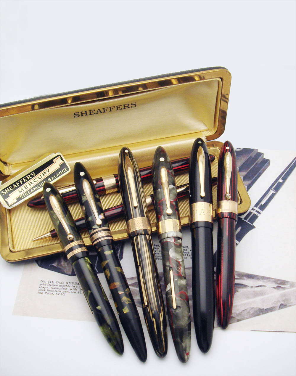 Introduction
Sheaffer’s 1929-1941 Balance is a classic collectable pen. Company documentation for this series is amongst the best available for any period pen, and we are blessed today with at least nine catalogues, with key company brochures, and with innumerable advertisements. Collectors thus have a legitimately strong sense of Balance’s catalogued (and more broadly, documented) range. Off-catalogue variants are known, pens in particular with special cap-bands; this perhaps should not cause surprise, given that the series was successful, long running and of high quality, with a large model range, manufactured by a major player involved in many markets. Such pens spice the collecting cholent no doubt. Balances with special cap-band styles offer challenges to collectors including: identifying available variants, understanding their purpose(s) in the Sheaffer continuum, assessing rarity and cachet, and-- yes-- acquiring pens for personal collections. Within the context of typical catalogued variants, I will address the first three of these challenges. Regarding the fourth challenge, I fear you will have to hunt on your own for the actual pens; some secrets stay with me. 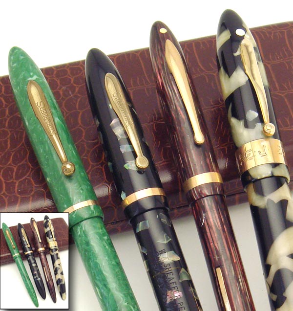 Period Sheaffer
catalogues show each Balance variant
with a single smooth cap-band, done either chrome
plated, gold-filled, or solid-gold, the
cap-band’s size and composition
dependent on the given pen’s tier-- its position in
the Balance hierarchy, based on trim, nib type,
price, etc. For catalogued pens the full-ball
clip of 1929-1934 then the flat-ball clip used from
1934-1935 (through 1941 on lower tier pens) are
imprinted “Sheaffer’s”, unlike the smooth radius clip used
on higher tier pens from 1935 onward. The catalogued
exceptions include the solid-gold-trim Autograph line and
the all-gold Masterpiece, which have smooth (no
“Sheaffer’s” imprint) clips independent of clip shape. Period Sheaffer
catalogues show each Balance variant
with a single smooth cap-band, done either chrome
plated, gold-filled, or solid-gold, the
cap-band’s size and composition
dependent on the given pen’s tier-- its position in
the Balance hierarchy, based on trim, nib type,
price, etc. For catalogued pens the full-ball
clip of 1929-1934 then the flat-ball clip used from
1934-1935 (through 1941 on lower tier pens) are
imprinted “Sheaffer’s”, unlike the smooth radius clip used
on higher tier pens from 1935 onward. The catalogued
exceptions include the solid-gold-trim Autograph line and
the all-gold Masterpiece, which have smooth (no
“Sheaffer’s” imprint) clips independent of clip shape. Known off-catalogue cap-band findings include: a) patterned non-single (double and triple) cap-bands, b) patterned single extra-wide ( fish-scale and the lined jeweler’s) cap-bands, c) smooth but unusually wide (or narrow) single cap-bands, and d) “special-color” Autographs, pens with solid gold cap-bands of typical size found on colors (and even other Sheaffer series) not catalogued with solid gold trim. I suspect pens from first two categories (patterned cap-bands) served a different purpose than did both the special color Autograph pens and pens with cap-bands simply extra wide or narrow. Special smooth (lacking the “Sheaffer’s” imprint) clips are found on special cap-band pens that carry the flat-ball clip, emphasizing that affected pens are dedicated products and not merely casual cap-band upgrades. The always-smooth later-era radius clip used on higher-line pens sees no difference when matched to special cap-bands. The early (1929-1934) full-ball (“humped”) clip pens with special cap-bands generally have normal “Sheaffer’s”-imprinted clips, but occasional examples appear with smooth full-ball clips; perhaps the decision to release special smooth clips occurred near the switch from full-ball to flat-ball clip. Dating the Patterned
Off-Catalogue Cap-Bands
Dating the first appearance of each of the special cap-bands is based largely on observation. Whilst the double cap-band makes the earliest appearance among the special cap-bands (late 1930 or 1931) and whilst desk pens are documented ( though not catalogued, per se) by Sheaffer with double barrel bands in 1931, the other USA-based special patterns-- triple, fish-scale, and jeweler’s (vertically lined)-- first appear at the earliest in mid-late 1934. This is based on finding all three of those patterns on pens featuring both the flat-ball clip (believed introduced in mid-late 1934) and colors already in use by that time: the first Grey Pearl (red-veined gray) and Ebonized Pearl (black with mother-of-pearl chips). As both colors still are documented in 1935, the first appearance of triple, fish-scale and milled cap-bands might be as late as 1935. Based on the polling of several of the great collections, these three cap-band styles do not appear on pens with the earlier full-ball clip or with earlier colors. Explaining the Off-Catalogue
Cap-Bands
When confronted by uncatalogued and/or otherwise anomalous pens, collectors variably invoke-- or perhaps retreat to-- a series of words that taken in their entirety can account for nearly any strange finding. A rapid fire sequence passes through the gray matter: “Prototype”, “Experiment”, “Frankenpen/Mixture”, “Transitional”, “Lunchtime Special”, “Niche Market” (eg. specific promotion, store, region or season), and “Special Order”. Some terms inherently are ambiguous. Some lend themselves to grandiose use, allowing the owner of said pens to embrace undue puffery. Some are well overused today. Most-- even if ultimately accurate for specific pens-- do not lend themselves to easy proof. Fortunately, we readily can dismiss several from subsequent consideration. That the double band, the triple band, and the wide single non-smooth cap-bands were used for years argues overwhelmingly against prototype or experimental goals and argues against the infamous lunchtime special notion, the idea that factory line workers with too much time on their hands created anomalies just… because. Whilst caps, barrels and nibs often can be mixed inappropriately by collectors, mixes cannot explain the very existence of pens with these cap-bands, as no potential donor pens exist; too there is huge physical challenge to swapping cap-bands . We are left it seems with the concepts of niche market and of special order. Niche markets might have included the annual holiday season, a particular geographic region, a category of store or even a particular store chain, thus explaining the frankly rare double, triple, and fish-scale cap-bands and the merely relatively uncommon lined jeweler’s cap-bands.  Special order/special purpose notions go a long way to explain smooth but extra wide or unexpectedly narrow cap-bands as well as the findings of solid-gold (Autograph) trim on special color pens and even on Sheaffer pen-pencil combos. Customers (end users) could have requested special variants, perhaps from special order lists lost to history, perhaps by custom request. Pens meant for awards or for advertising might have had special features. This is speculative, but it provides context for further discussion. Double Decorative Cap-band
 The off-catalogue
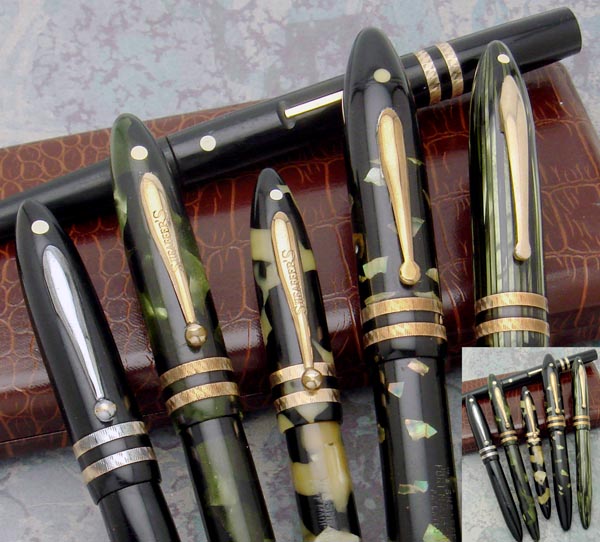
double (double deco) cap-band appears on pens from
at earliest late 1930 through at least 1938, perhaps
later. It is the earliest special cap-band
pattern found on Balance. Pens are
found starting with the early full-ball clip
in early colors including Black-and-Pearl and
the first (mottled, not striped) Marine Green,
whilst no other special cap-band styles are known on
pens of those early colors. All
the Black-and-Pearl full length pens I’ve seen
so far have normal length barrels, not the
extra-long barrels found with the earliest (1929 or
so) of the early-era Balances, and all have the
internal lever ring (rather than lever-pin), the
ring currently believed (but not proven) to have been
introduced in late 1930. The full-ball clips,
expected with early-era colors, are
overwhelmingly (but not absolutely) of the typical
catalogued “Sheaffer’s”-imprinted sort;
occasionally, however, special smooth full-ball
clips are seen. Special smooth (no “Sheaffer’s”
imprint) flat-ball clips are the rule
during the 1934-1935 flat-ball-clip era.
Later radius-clip pens in late-era striated colors
are known, though both known examples
are better-tier pens, thus having typical smooth
radius clip. No radius-clip-era low-tier (which
still feature the flat-ball clip) pens are known; if any
exist, they probably have the special smooth
flat-ball clip. The off-catalogue
double (double deco) cap-band appears on pens from
at earliest late 1930 through at least 1938, perhaps
later. It is the earliest special cap-band
pattern found on Balance. Pens are
found starting with the early full-ball clip
in early colors including Black-and-Pearl and
the first (mottled, not striped) Marine Green,
whilst no other special cap-band styles are known on
pens of those early colors. All
the Black-and-Pearl full length pens I’ve seen
so far have normal length barrels, not the
extra-long barrels found with the earliest (1929 or
so) of the early-era Balances, and all have the
internal lever ring (rather than lever-pin), the
ring currently believed (but not proven) to have been
introduced in late 1930. The full-ball clips,
expected with early-era colors, are
overwhelmingly (but not absolutely) of the typical
catalogued “Sheaffer’s”-imprinted sort;
occasionally, however, special smooth full-ball
clips are seen. Special smooth (no “Sheaffer’s”
imprint) flat-ball clips are the rule
during the 1934-1935 flat-ball-clip era.
Later radius-clip pens in late-era striated colors
are known, though both known examples
are better-tier pens, thus having typical smooth
radius clip. No radius-clip-era low-tier (which
still feature the flat-ball clip) pens are known; if any
exist, they probably have the special smooth
flat-ball clip.Their absolute rarity limits discussion of relative rarity amongst the colors, since in any given color fewer than ten-twenty double deco cap-band pens are widely known-- counting all the great collections-- save perhaps for the mottled Marine Green, which in my experience is the most prevalent color. The double cap-band is predominantly an early era finding, found less frequently on middle-era colors and remarkably rarely on late-era colors. I know of a grand total of two late-color pens amongst numerous possible sizes, colors and trim tiers. I own a standard size striated Marine Green pen and have seen image of a slender striated Gray Pearl (not “Grey Pearl”, as the earlier two gray colors were named) pen. Rare, baby. Triple Decorative Cap-Band
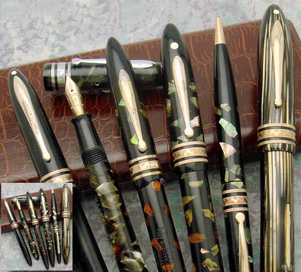 Triple decorative (triple deco) cap-band pens (thin-fat-thin) I consider more scarce even than the double cap-band pens, though limited sample again muddies that assessment. This cap-band first appears at earliest in mid-late 1934, possibly as late as 1935. All flat-ball-clip pens have the special smooth clip. First appearing with Grey Pearl #1 (gray-with-red-veins) and with Ebonized Pearl, it is found also with the 1935 Grey Pearl #2 (gray-pearl/black mottled) and even makes it to the late Balance era, appearing on just one known brown striped (a 1937-1941 color) oversized pen, a pen I’m honored to own. In fourteen years collecting I doubt I’ve seen even twenty triple cap-band pens. Image X- Triple Cap-band The “Fish-Scale” Cap-band
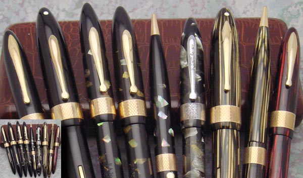 Perhaps more scarce than the double cap-band though seemingly a bit less rare than the patterned triple cap-band is the extra wide patterned single band called “fish-scale” by collectors. This appears on White Dot and non White Dot models; pens range from slender to oversized. This cap-band first appears at earliest in mid-late 1934, possibly as late as 1935. All flat-ball clip pens have the special smooth clip. First appearing with Grey Pearl #1 (gray-with-red-veins) and with Ebonized Pearl, it is found also with the 1935 Grey Pearl #2 (gray-pearl/black mottled) and makes a stronger appearance in later years than does the triple cap-band, being found comparatively more frequently with the 1935+ radius clip and in 1936+ striated colors, including (so far) Carmine, Marine Green and Brown. The triple cap-band thus was used at least through 1939, perhaps as late as 1941. Fish-scale was the last of the off-catalogue USA-sourced styles I discovered, my first encounter being at a Long Island Pen Show some years back with an oversized Ebonized Pearl set I unfortunately did not purchase, due to price . I do harbor some regrets, as I’ve never seen another in that size-and-color. Canadian Edge-Lined Wide
Cap-Band.
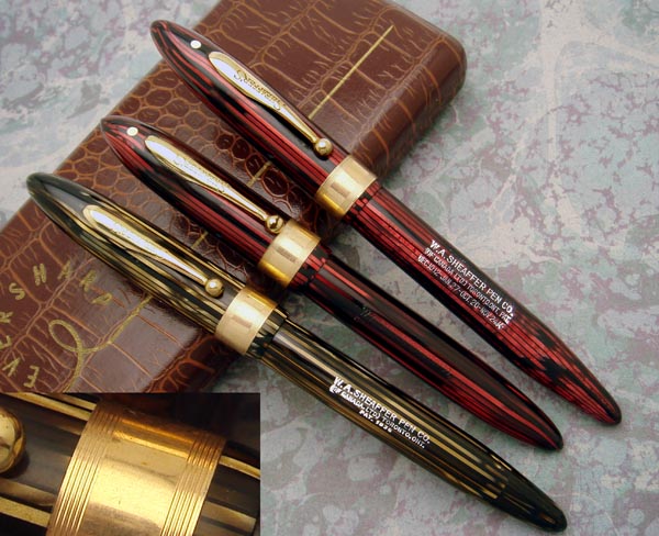 I’ve seen the double cap-band on Canadian pens, and have seen a questionably Canadian wide-milled jeweler’s cap-band pen; there is some debate about whether the jeweler’s cap-band crossed the border to Canada. I’ve yet to see triple band or fish-scale cap-band Canadian pens, though that does not not preclude their existence. Sheaffer in Canada does appear to have had a minority Balance cap-band all its own, wide and smooth save for a few circumferential lines at top and bottom. I’ve seen very few (and acquired all I’ve seen); all so far are in late striped plastic, dating at earliest to ~1937. For more about these, see the last issue of PENnant. The “Jeweler’s” Cap-bands
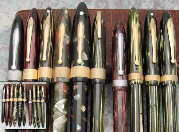 The
collector-named jeweler’s cap-band-- single,
extra wide, with milled (lined) pattern--
overwhelmingly is the most commonly found off-catalogue
cap-band; it is the one for which the most available
(though still quite sparse) Sheaffer documentation
exists. Whilst a detailed treatment of
the Jeweler’s cap-band would warrant a dedicated article,
we can cover the basics and explore a couple quirks. Along
with most of the special patterns, it first appears at
earliest in mid-late 1934, found on gray-with-red-veins
and Ebonized Pearl pens with flat-ball clip.
It is found on all subsequent catalogued colors and even
appears on the 1941 military-clip Balance, giving a ~ late
1934-1941 run. The
collector-named jeweler’s cap-band-- single,
extra wide, with milled (lined) pattern--
overwhelmingly is the most commonly found off-catalogue
cap-band; it is the one for which the most available
(though still quite sparse) Sheaffer documentation
exists. Whilst a detailed treatment of
the Jeweler’s cap-band would warrant a dedicated article,
we can cover the basics and explore a couple quirks. Along
with most of the special patterns, it first appears at
earliest in mid-late 1934, found on gray-with-red-veins
and Ebonized Pearl pens with flat-ball clip.
It is found on all subsequent catalogued colors and even
appears on the 1941 military-clip Balance, giving a ~ late
1934-1941 run. The cap-band itself is found in two sizes, the narrower (which lacks cartouche for personalization) generally associated with the lower couple Balance tiers particularly with pens of slender size. The wider variant (with cartouche) is far more prevalent today, and is found on pens of all three diameters, generally with cap features of the top two tiers, sometimes with features that blur the lines that usually separate Balance’s typical catalogued models/tiers. 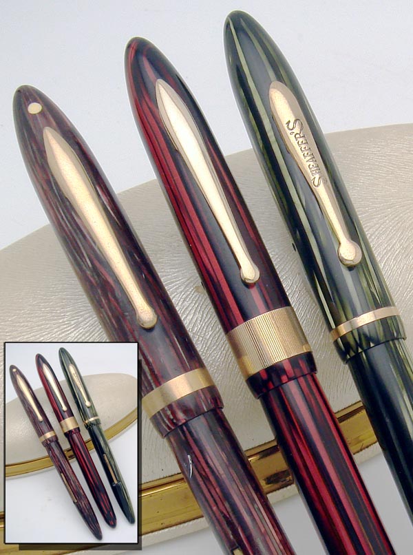 Consider the Sheaffer Balance Mercury, one of a few Jeweler’s cap-band pens with known model names. Save for its special cap-band, Mercury at first blush appears to be a typical late-era 2nd tier Balance (radius clip, non-White Dot) done in the long-slender size, but such is not the case. Whilst Sheaffer catalogues pens with typical smooth cap-band in a couple sizes with the radius-clip, non-White Dot cap, it doesn’t catalogue such a creature specifically in the long-slender size. In this size, the catalogue offers a 1st tier White-Dot pen with this clip and a third tier non-white-dot pen with the lower-tier flat-ball clip. Mercury’s cap thus has special features even beyond its fancy cap-band. And, that’s not all. During Balances late era all catalogued 2nd tier (radius-clip cap without the White Dot) pens carry the Feathertouch #5 two-tone nib, yet the long/slender Mercury (along with its short/slender sister, Diana) has a lower tier monotone #3 nib; Mercury and Diana thus blend seemingly 2nd-tier caps with third tier nibs. With special model name, with special cap-band, with special additional cap features and with special arrangement between nib and clip, Balance Mercury well illustrates there was more to special cap-band pen production and marketing than simply slapping fancy cap-bands on typical pens. Let’s now carry this observational study beyond funky pattern Balance cap-bands and address special behavior of smooth cap-bands. Special Autograph (gold trim)
Pens: Colors and Cap-band Width.
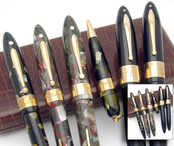 Catalogued pens from
Balance’s Autograph line each have a single,
wide, solid 14 karat gold cap-band, usually
with a solid gold clip as well. The first known
Balance catalogue from 1930 shows such pens in
black, Marine Green (mottled), and Black/Pearl.
Later catalogues show black alone. Cap-bands all are
the same width, independent of pen size.
Autograph pens occasionally are found in
off-catalogue colors, or with an extra-wide cap-band. I’ve
seen off-catalogue Autograph pens in red-veined-gray
(Sheaffer’s 1st Grey Pearl) and in Ebonized Pearl,
as well as just one oversized striated brown
pen and just one 1941 military-clip pen
in Carmine. Perhaps other colors will
emerge. These certainly could have been easy
special order items back in the day. Perhaps one day
we will find a Sheaffer pamphlet declaring, “Autograph
style pens in other colors available at customer’s
request”. The “Rudy” Autograph Sheaffer Combos
support the notion of special order special color
Autographs. Too, we see frankly
rare Autograph pens with extra-wide cap-band.
All I’ve seen have been oversized black pens,
some with an “award pen” flavor. Catalogued pens from
Balance’s Autograph line each have a single,
wide, solid 14 karat gold cap-band, usually
with a solid gold clip as well. The first known
Balance catalogue from 1930 shows such pens in
black, Marine Green (mottled), and Black/Pearl.
Later catalogues show black alone. Cap-bands all are
the same width, independent of pen size.
Autograph pens occasionally are found in
off-catalogue colors, or with an extra-wide cap-band. I’ve
seen off-catalogue Autograph pens in red-veined-gray
(Sheaffer’s 1st Grey Pearl) and in Ebonized Pearl,
as well as just one oversized striated brown
pen and just one 1941 military-clip pen
in Carmine. Perhaps other colors will
emerge. These certainly could have been easy
special order items back in the day. Perhaps one day
we will find a Sheaffer pamphlet declaring, “Autograph
style pens in other colors available at customer’s
request”. The “Rudy” Autograph Sheaffer Combos
support the notion of special order special color
Autographs. Too, we see frankly
rare Autograph pens with extra-wide cap-band.
All I’ve seen have been oversized black pens,
some with an “award pen” flavor.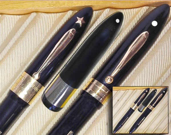 A pair of solid-gold-trim Autograph pens support special order production at Sheaffer; the “star” award pen so far is unique-to-hobby. It features a golden star above the clip, in place of the usual White Dot, and has extra wide cap-band. Aftermarket modification is excluded by the presence of a proper White Dot seen hiding on the back of the cap. Clearly, Sheaffer made the pen to accommodate the special star. Also one-known is an Autograph Balance with solid gold cap-band of typical girth but with relatively raised rims thus with an overt indentation centrally. I call it the wheel rim cap-band as it resembles a car rim, sans tire. Special Metal (non 14k)
Autograph (solid gold trim) Pens
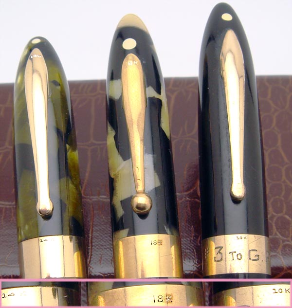 All catalogued Autograph (solid gold trim) Balances have 14 karat trim. Rare pieces exist with gold trim that is not 14k, though (so far) still of typical cap-band width; I own one and have heard of maybe a couple other pens done in 18k trim. Whilst the pens carry no other special markings, collectors have hypothesized these were meant for the French market, where items reportedly could not be offered as solid gold if < 18k. Still, whilst my for-France Parker Vacumatics have 18k-marked nibs, the only 18k-trim Balance I own has no visible special markings on what might be a typical 14k nib, noting I have not removed nib from pen to explore hidden areas. Recently I stumbled onto my first 10-k Autograph, this one having a gold-filled clip. SpecialSeries Autograph:
Autograph Combinations
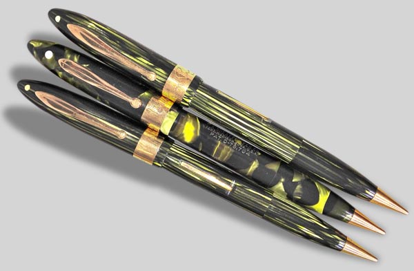 wIf ever there were
a Balance-related series that screams "special
order" instead of invoking the niche/limited
market, it is the "Rudy" Sheaffer combos.
Sheaffer’s pen-pencil Combination (collectors generally
call these, “combos”) is catalogued only in
non White Dot (non Lifetime) form, in three colors
in 1930 and in one color (black) in 1935. An
off-catalogue fourth color (mottled Marine Green) fairly
frequently is found, and relatively uncommon off-catalogue
White Dot pens are known . Where things get a bit crazy is
with off-catalogue Autograph (solid gold cap-band and
clip) combos. Too, combos cease to appear in
Sheaffer catalogues well before striped green pens
appear, yet "Rudy" combos are known in striped
green. A mere handful are known to the hobby,
and nearly all (perhaps truly all) are marked as gifts
from someone named… Rudy. Was “Rudy”… Rudy
Vallee? wIf ever there were
a Balance-related series that screams "special
order" instead of invoking the niche/limited
market, it is the "Rudy" Sheaffer combos.
Sheaffer’s pen-pencil Combination (collectors generally
call these, “combos”) is catalogued only in
non White Dot (non Lifetime) form, in three colors
in 1930 and in one color (black) in 1935. An
off-catalogue fourth color (mottled Marine Green) fairly
frequently is found, and relatively uncommon off-catalogue
White Dot pens are known . Where things get a bit crazy is
with off-catalogue Autograph (solid gold cap-band and
clip) combos. Too, combos cease to appear in
Sheaffer catalogues well before striped green pens
appear, yet "Rudy" combos are known in striped
green. A mere handful are known to the hobby,
and nearly all (perhaps truly all) are marked as gifts
from someone named… Rudy. Was “Rudy”… Rudy
Vallee? The inscriptions on all three combos in the image bear the same basic penmanship, suggesting all were all given by the same Rudy. The early (mottled) Marine Green is engraved "From Rudy to Major L." No great clues here. The real supportive clues come from the engravings on the late (striped) Marine Green Rudy combos which are engraved: "from Rudy to Hugh Cummings" and "From Rudy To Nels Laakso". Hugh Cummings was a Hollywood screenwriter and director and a contemporary of Mr. Valle in Hollywood. Nels Laasko, another contemporary of Mr. Vallee, played the trumpet/coronet in a band which performed music for one of Mr. Vallee's movies and which Mr. Vallee brought to Hollywood. 1 The great rarity of and specific gift-giver associated with the Autograph Sheaffer combos provide remarkable support for special-order status, and lend tangential support to the other special-color Balance Autographs being special order as well. The "Rudy" Autograph combos are known in both Marine Greens, the mottled combo dating to earliest mid-late 1934 in view of the relatively late (for that color) flat-ball clip, which is smooth (expected for an Autograph), to at least 1937, as that is when the striated Marine Green first appeared, that color running through 1941 for Balance. Extra Wide Smooth
Gold-Filled Cap-Bands
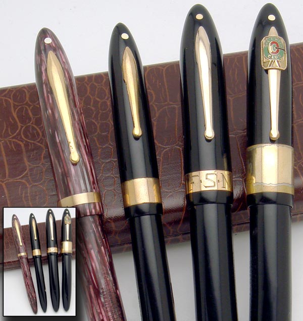 Black Balances exist with gold-filled trim and with off-catalogue extra-wide single cap-bands, with more than one special width known. I’ve seen just one with a moderately wide cap-band, found in fact whilst I was writing this article; it is of same size as a known extra-wide but also undocumented gold-filled cap-band found on an earlier flat-top Sheaffer. An ultra-wide band has been found on an award pen of sorts, packing again a special order flavor, given by a corporation to a successful salesman. In addition to the band inscribed with the award, the clip features a crimped company logo. First Tier- Third
Tier Fusion Pen. White-Dot, Thin Cap-Band.
Fairly scarce slender pens in late-era colors exist which seemingly blend the 1st-tier Balance Sovereign (White Dot, radius clip, hefty cap-band and Lifetime nib) with the 3rd-tier Balance Craftsman ( non-White Dot, flat-ball clip, thin cap-band, and #3 nib), making a ‘“fusion” pen, with White Dot, Lifetime nib, thin cap-band, and flat-ball clip. Fusion pens have an added tell, in that the flat-ball clips are smooth, lacking the expected “Sheaffer’s” imprint, thus indicating a special-role flavor. Balances meant to be private advertising/corporate pens are known, pens based on the 3rd-tier Craftsman but with the special smooth flat-ball clip, marked with corporate barrel logos (still with the Sheaffer barrel imprint) and/or with crimped-to-clip company badges. Such special Craftsman pens are closer in appearance to the fusion pen, but still lack the White Dot and Lifetime nib found with this special pen. 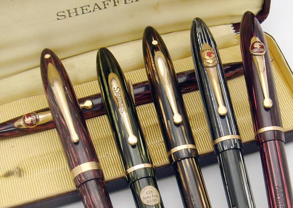 Enough fusion pens
are found to disfavor simple accidental production.
Did Sheaffer make White-Dot variants meant to take company
logos, some having escaped the plant before
acquiring non-Sheaffer corporate markings? I have
yet to see one of these fusion pens with corporate logos,
thus I cannot prove that purpose, and in any case
the already catalogued Sovereign would have well served
that niche. Could leftover pre-advertising non-White
Dot pens have been fitted with the White Dot to help get
rid of them? Seems like too much hassle. Could they
have served another imagined purpose, say serving as pens
for internal consumption, given or sold only to
Sheaffer employees, allowing easy tracking of pens, as
they differed then from any sold to the
public? I... don't... know. All the fusion
pens I’ve seen are slender (both long and short) late-era
pens with gold-filled trim. I’ve seen at least
black, striped green and striped brown pens. Enough fusion pens
are found to disfavor simple accidental production.
Did Sheaffer make White-Dot variants meant to take company
logos, some having escaped the plant before
acquiring non-Sheaffer corporate markings? I have
yet to see one of these fusion pens with corporate logos,
thus I cannot prove that purpose, and in any case
the already catalogued Sovereign would have well served
that niche. Could leftover pre-advertising non-White
Dot pens have been fitted with the White Dot to help get
rid of them? Seems like too much hassle. Could they
have served another imagined purpose, say serving as pens
for internal consumption, given or sold only to
Sheaffer employees, allowing easy tracking of pens, as
they differed then from any sold to the
public? I... don't... know. All the fusion
pens I’ve seen are slender (both long and short) late-era
pens with gold-filled trim. I’ve seen at least
black, striped green and striped brown pens.Sheaffer Documentation for the
Off Catalogue Cap-Bands.
What Sheaffer information do we have for these off-catalogue pens? Well.. remarkably little. By definition, such pen don’t appear in known catalogues. I know of one illustrated reference to the double band pattern, though only as barrel bands for a desk pen not as cap-bands for pocket pen, in Sheaffer’s October 1931 Retailer’s Review. Of note such pens are found in a section specified for jewelers, separated from pens offered to dealers in general. Beyond this , I know of tiny snippets of company material just for the lined jeweler’s cap band and only for the wider of its two styles. For the jeweler’s cap-band, information both precious and scarce is found in a couple known adverts, in price codes on pen barrels, in model codes and prices on clip tags, and in model names on foil labels in boxed sets and on barrel stickers. A couple ~ 1936 adverts in a private collection show a crude illustration of a Jeweler’s cap-band pen in context of Sheaffer’s connection with the Gregg Writing School. The cap-band pattern is not specifically cited in the ad text. These ads illustrate the cap-band, thus formally connecting it to Sheaffer, but they do not provide further enlightenment. Starting perhaps in 1937 or 1938, Sheaffer began marking pen prices (in cents) on pen barrels (e.g.. “1000” is found heat stamped on $10 Premier and Statesman models). Too, in 1938, quite late in Balance’s run, it introduced model names for its catalogued pens. Thus for pens starting 1937-1938 there is potential now to find novel barrel price imprints and novel model names for special cap-band pens. Most off-catalogue cap-band pens from 1938-1941 carry the lined jeweler’s cap-band. Whilst nearly all Jeweler’s cap-band pens-- even with late era colors -- lack barrel price codes, rare price-coded examples have appeared; the prices found indeed are greater than those of related typical catalogued pens. A couple price-tagged pens have turned up, confirming model codes unique to this special cap-band and reflecting/confirming the higher price point for at least some of the special cap-band pens. I know of four late-era special model names based on foil tags in boxed sets and on barrel stickers, names never used for catalogued siblings. This information is golden. The existence of formal model codes, of formal model names and of dedicated prices argue that the special pattern cap-band pens were not just special order items, but were dedicated products, intended for at least limited retail sale. 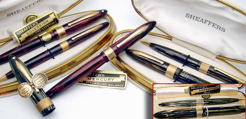 What to call this extensive cluster of off-catalogue Balances, besides… well.. uncatalogued or off-catalogue ? Currently, nothing more is necessary. Some object, however, noting that discovery of even a single pertinent catalogue would invalidate these descriptors. With 35 years of hobby research having failed to procure such paper, the risk is modest, and too there are worse things than having to change a descriptor once per generation in the face of new information. Indeed, I’d be quite thrilled to terminate these pens’ off-catalogue status whilst celebrating the discovery of a targeted catalogue. For those who favor more generalized terminology or who have ardent philosophical objection to an academic context that embraces “catalogued vs uncatalogued”, one instead can label all these as special cap-band pens, subject to debate of the import of “special”. Advocates exist for descriptors including fancy, funky, and even minority. There have been rumblings to broaden the jeweler’s descriptor from specific use for the vertically lined wide cap-bands to include instead all the special-pattern (double, triple, fish-scale, maybe Canadian lined-edge) cap-bands , based on suspicion such pens were offered specifically to a segment of the retail jewelry market, though this is not yet proven and though there would be significant collector convention to overcome in using that label for anything beyond the milled-band pens. Again, I do consider the pens we’ve examined to fall into two broad groups, the first composed of the non-smooth patterns: double, triple, fish-scale, and lined pens that likely were niche market-- for special season, store category or specific store chain-- with the second group comprising cap-bands still smooth just extra-wide or narrow or found on off-catalogue colors, pens that might have been special order or special purpose.  The off-catalogue pens range from relatively uncommon to overwhelmingly rare, and I offer the following with the caveat that of course I do not know all pens in all private collections. Save for the vastly more prevalent jeweler’s cap-band, the patterned (double, triple, fish-scale, edge-lined Canadian) cap-bands are frankly rare, since pens with each of these cap-bands in any of Balance’s specific color/size mixes are just one or a few known or even so far unknown altogether. Amongst thousands of Balances seen or handled, I doubt I’ve encountered even thirty pens total with the triple band or with the fish-scale band, counting all pen sizes and colors. I have seen just three of the edge-lined Canadian cap-band pens. Smooth extra-wide single cap-bands are just a few total known to the hobby and appear so far only on black pens. Even the jeweler’s cap-band sees some quite scarce variants. Special color Autograph (solid gold trim) pens are quite scarce, with few known in each of just a few of Balance’s size-color variants. 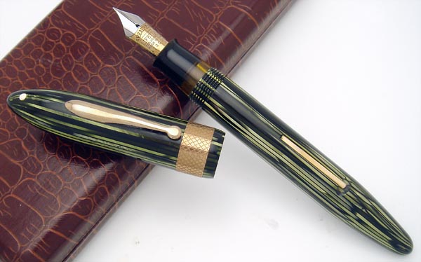 As with most esoteric findings for old pens, the added economic value from the funky cap-bands is disproportionately small compared to their relative or absolute scarcity. I consider the special cap-band Balances to be under appreciated… exotic sleepers in the Sheafferverse. Currently, such pens are hunted in fairly rarified collecting circles, generally by advanced collectors who cherish the obscure. The jeweler’s cap-band, as with a similarly named lined off-catalogue cap-band found with competitor Parker’s Vacumatic series, in general adds at least a modest value bump. Other cap-band findings should add more value… but sometimes don’t. If willing to pay 150% to, oh, 250% the price of otherwise typical pens, collectors can buy pens seen just one per hundred or one per thousand typical siblings… or even “none previously identified”. How cool is that?! That this is the first formal survey of this Sheaffer exotica demonstrates that our 35 year old hobby still offers space for fresh research. I invite comments from readers of this article, especially as Sheaffer is not my primary pen collecting focus (figure “wee dabbler”). It is my hope and expectation that this first core text will be the springboard for future research by others and will prod collectors to examine their holdings and to come forth with new information. Oh… and yeah… if you happen to have spare special cap-band pens which my personal collection lacks… do drop me a note. Send comments to isaacson@frontiernet.net -------------- Footnote: 1Personal communication from Pat Mohan. The author extends thanks to Pat Mohan and to Roger Wooten for sharing pertinent information and pens. Photo-illustrated pens are from the author’s collection except where noted. Photos are by the author except where noted. |